On the fashion stage of the football world, Chicago Fire has once again demonstrated the deep integration of the team and urban culture with the release of their 2025 away kit, "Municipal." This kit is not just a piece of match equipment but an artwork that combines the waterways of Chicago, the Municipal Device, and football culture. It is like a canvas filled with the charm of the city, perfectly blending the rivers of Chicago with the team's fighting spirit, becoming a unique sight on the football pitch.

Kit Design: A Symphony of Rivers and the City
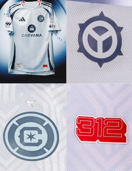
The 2025 away kit features a main color of light blue (Sky Tint), resembling the clear waters of the Chicago River, paired with navy and red details that evoke the bridges and buildings along the riverbanks. Light blue symbolizes clarity and vitality, while navy and red represent depth and passion. Their combination not only showcases the team's modernity but also conveys the unique charm of Chicago as the "Windy City."
The "Y" shaped pattern on the kit is inspired by the Municipal Device of Chicago, which can be found on street lamps, railings, buildings, and structures throughout the city, acting like a bond connecting the team and the urban landscape. This design not only symbolizes the confluence of the north, south, and main branches of the Chicago River at Wolf Point but also highlights the close connection between the team and the city. The number "312" is printed on the lower left hem of the kit, representing the downtown area code of Chicago, where the team trains (Endeavor Health Performance Center) and plays (Soldier Field). It serves as a badge of honor, tightly linking the team's glory with the city's culture.

Design Highlights: The Fusion of City and Culture
Crafted by Adidas, this kit is filled with a modern technological feel, reflecting the team's pursuit of innovation and cultural integration.
- Light Blue Main Color: Like the clear waters of the Chicago River, full of vitality and hope;
- Navy and Red Details: Resembling the bridges and buildings along the riverbanks, adding a touch of brightness to the kit;
- "Y" Shaped Pattern: Symbolizing the confluence of the river's branches, showcasing the city's unique landscape;
- Number "312": Emphasizing the team's connection to downtown Chicago, highlighting a sense of community.
Design Philosophy: A Symbol of Urban Culture
This kit is not just a piece of match equipment but a symbol of urban culture. It shows Chicago Fire's respect for and integration of the Chicago River and the Municipal Device, conveying the team's deep connection with the community. Every design element is like a carefully painted masterpiece, perfectly blending the urban landscape of Chicago with the passion of football.
Conclusion: Cherishing the City and Embracing the Future
The Chicago Fire 2025 away kit is now available at the Soccer777 Store. It is not just a kit but an artwork that carries the culture of Chicago and the team's spirit. Whether it is the light blue main color, the navy and red details, or the "Y" shaped pattern, this kit has become a treasure in the hearts of fans.
If you are interested in other kits from onlinw Chicago Fire jerseys store, visit the Soccer777 Online Store to explore more fantastic designs. Let's look forward to Chicago Fire writing new legends on the pitch in 2025, wearing this city-inspired kit.

没有评论:
发表评论